VeriFLY
VeriFLY is an automated ID verification system that provides an efficient, convenient and sanitary way for travelers to go through airport securities, minimizing face-to-face interactions especially under the current global health emergency.
Duration: 6 months (Jan 2020 - Jun 2020)
Problem
- The current ID verification system requires a large amount of manual labor.
- With COVID now in the picture, the face-to-face interactions and crowdedness at TSA can add a lot of potential risks to travelers' health.
VeriFLY's Solution
- An automated ID verification system that minimizes face-to-face interactions.
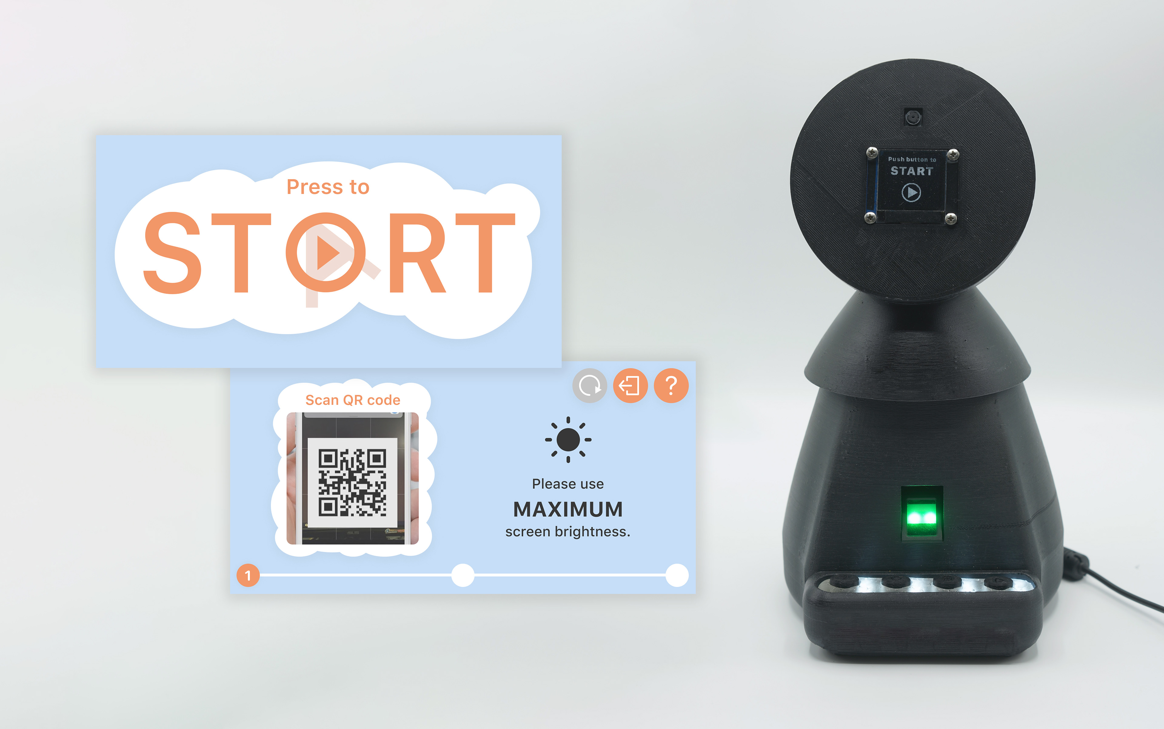
- A tabletop device that can scan a traveler's ID, verifies it, and then perform facial and fingerprint recognition to match their identity.
- A screen that guides travelers to smoothly use the ID verification system.
My Role
- User research: surveys, interviews, diary studies, personas.
- UX & UI design: storyboards, information architecture, medium-fidelity prototype, high-fidelity clickable prototype.
- Usability test
- Video editing
Tools
Adobe Illustrator / Figma / Adobe Photoshop / Adobe Premiere
Team Members
Lu Wei | UX Design & Product Design
Kelsey Guo | UX Research
Alan Feng | Software engineering
Design Process
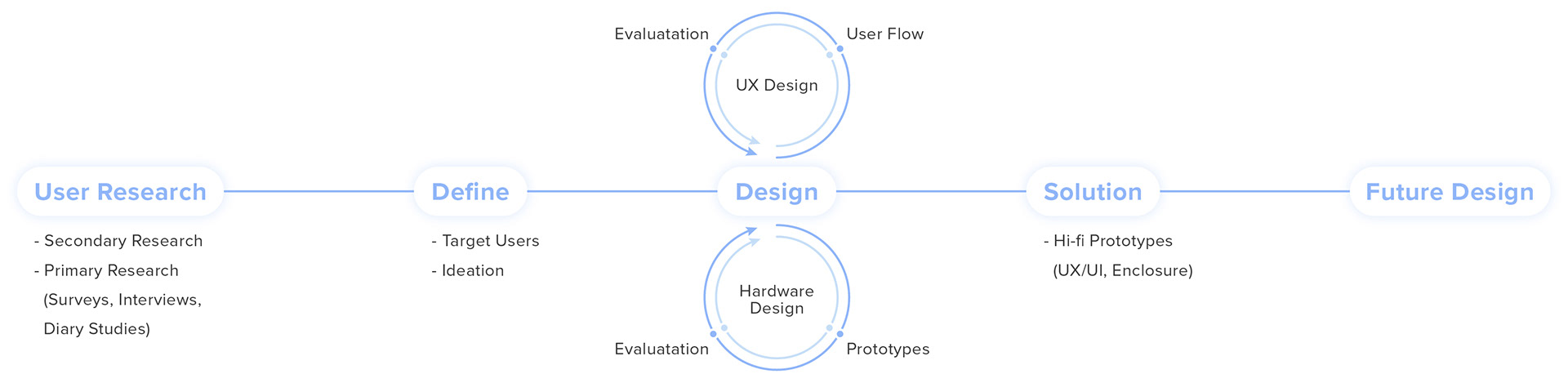
01. Secondary Research
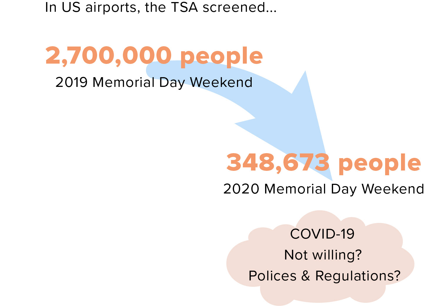
Through online resources, we learned that the number of people traveling during COVID-19 has significantly decreased compared to before. It indicated that people were concerned about the traveling during COVID-19. And we were excited by the unknown and uniqueness of this problem space.
In addition, we found that the airports and airlines are having multiple measures against the spreading of COVID-19:
- The airports have thorough cleaning every day.
- The airplanes are sanitized after each flight.
- Most stores are closed in the airports.
- Some airlines ask passengers to put on masks during the flight.
02. Primary Research
The primary research objective is to learn about travelers' airport experience under COVID-19, especially with the TSA security check. We included methods with both qualitative and quantitative data. And given the current global health emergency, we chose remote methodologies such as surveys, interviews and diary studies.
Research Questions
- How do people feel about their travel experience at the airport, from check-in to boarding?
- How has COVID-19 impacted people's airport experience?
- How do people feel about the TSA experience, from ID check to security screening, under COVID-19?
Target Users
Air travelers in general including novice and frequent flyers, with a focus on people who have traveled in the past 2 months during COVID-19.
Methodology 1: Survey
We determined our number of participants using a sample size calculator. Based on a 95% confidence level and 10 confidence interval, we determined that our survey sample size should be 96. The goal of this survey is to identify trends through quantitative data. We distributed the surveys through social media such as Facebook, WeChat and Instagram, and received exactly 96 answers.
Key Findings from Survey
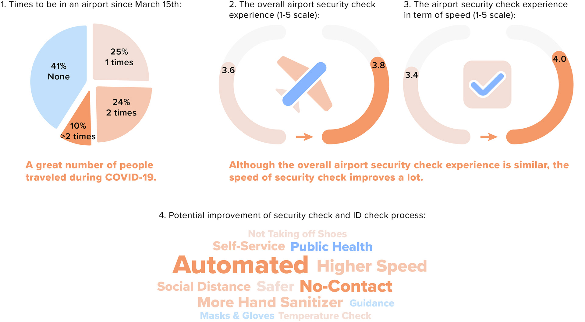
1. It is necessary to take some measures due to a great number of people traveled during COVID-19.
2. Although the overall airport security check experience is similar, the speed of security check improves a lot. The reason may be that there are less people in the airport during COVID-19, increasing the speed of security checks.
3. When asking for potential improvement of security check and ID check process, most people mentioned automated and no-contact ID check.
Methodology 2: Interview
We also conducted 8 interviews with travelers who have recently flew. We paired up to have a moderator and a note taker at each interview, and the interviews lasted from 25 to 45 minutes. All of interviewees expressed some level of concerns with the sanitary condition of TSA checks.
Key Findings from Interview
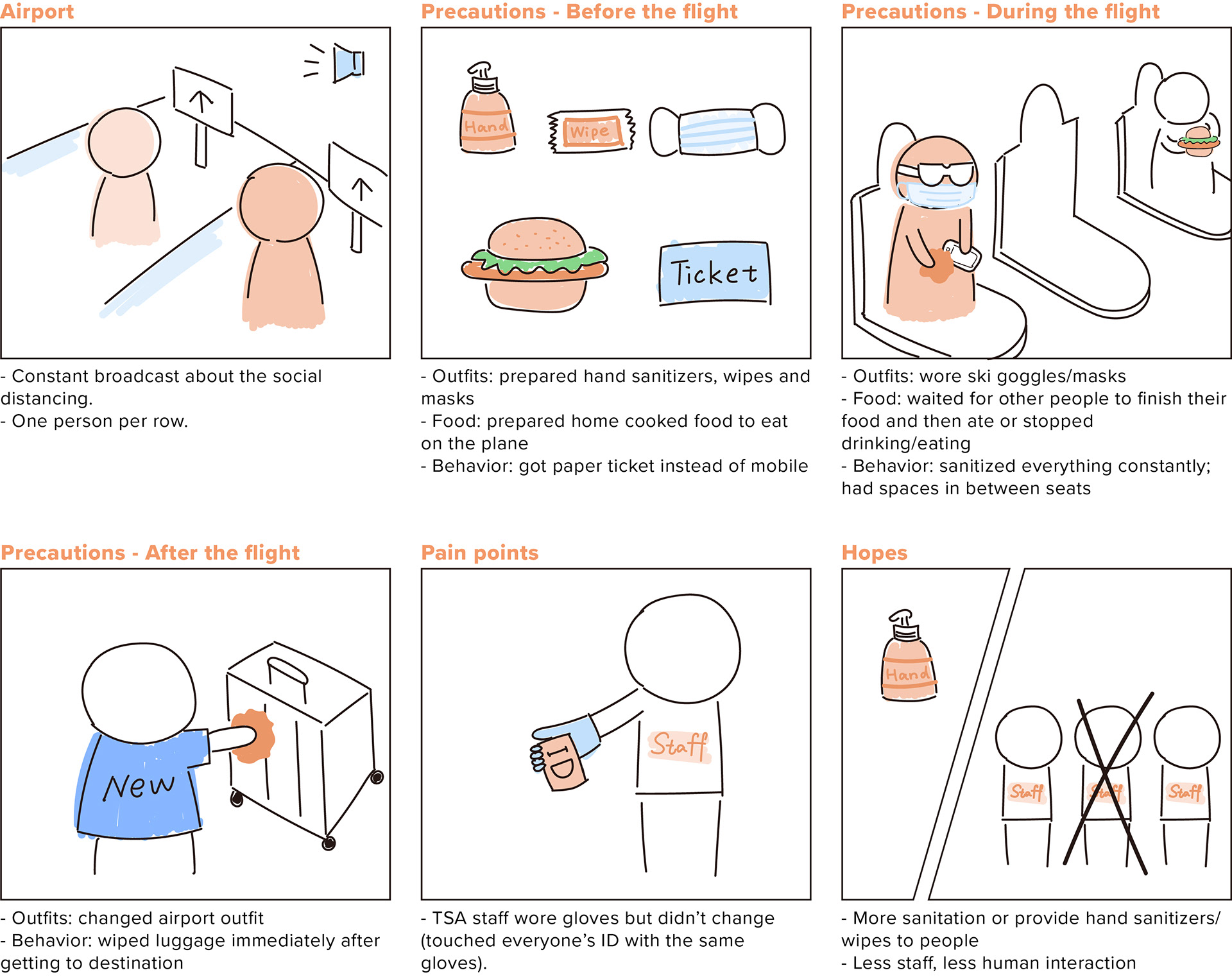
1. The airport takes a lot of measures in response to COVID-19, including the constant broadcast about the social distancing and the policy of one person per row.
2. Passengers took a lot of precautions before/during/after the flight to protect themselves from the virus. These precautions include the aspects of their outfits, food and behavior.
3. The pain point of passengers is that TSA staff wore gloves but did not change, so that they touched everyone's ID with the same gloves.
4. Most people hope more sanitation or the airport could provide hand sanitizers/wipes, and there could be less staff, decreasing human interaction.
Methodology 3: Diary Studies
We recruited 3 participants, and all of them took both international and domestic flights: 1 transcontinental, 1 intercontinental, and 1 regional (west coast) flight. The point of the diary studies is for us to learn about exactly how the users feel as they go through the process. In addition, we are able to get some real-time photos that we otherwise would not be able to get. Another reason we chose this method was that since we could not do field observations or acquire video footage of the airport, diary studies was a good way to get those "at-the-moment" data.
Key Findings from Diary Studies - Touch Point Analysis
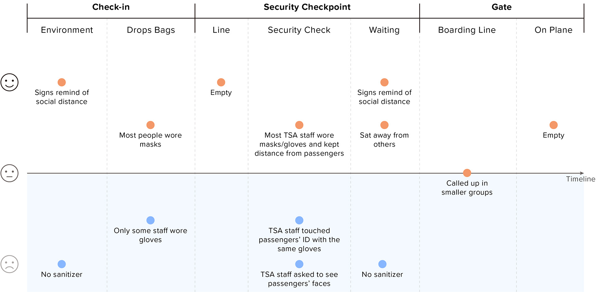
Some unpleasant experiences are:
1. TSA staff touched passengers' ID with the same gloves and did not change. Some TSA staff even did not wear gloves.
2. TSA staff asked passengers to see their faces.
3. There is few sanitizers in the airport.
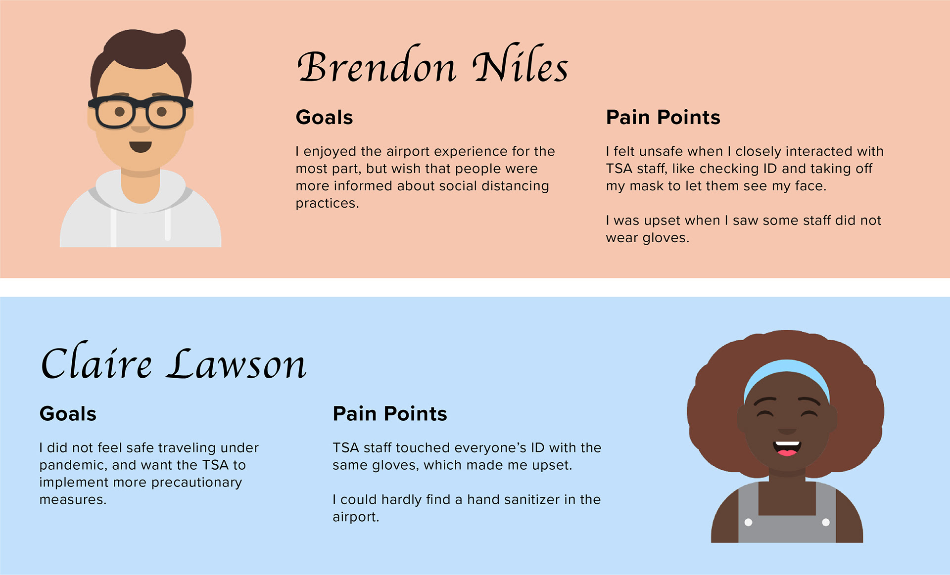
03. Target User Goals & Pain Points
04. Ideation
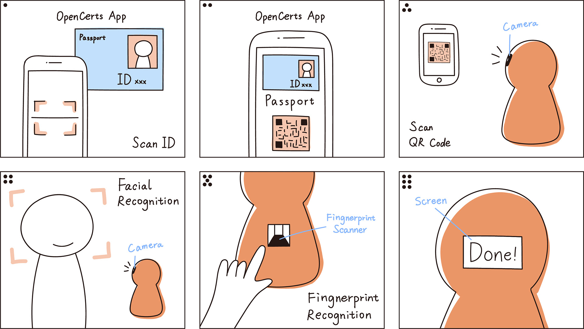
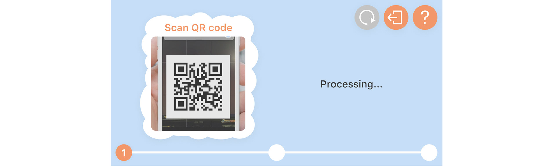
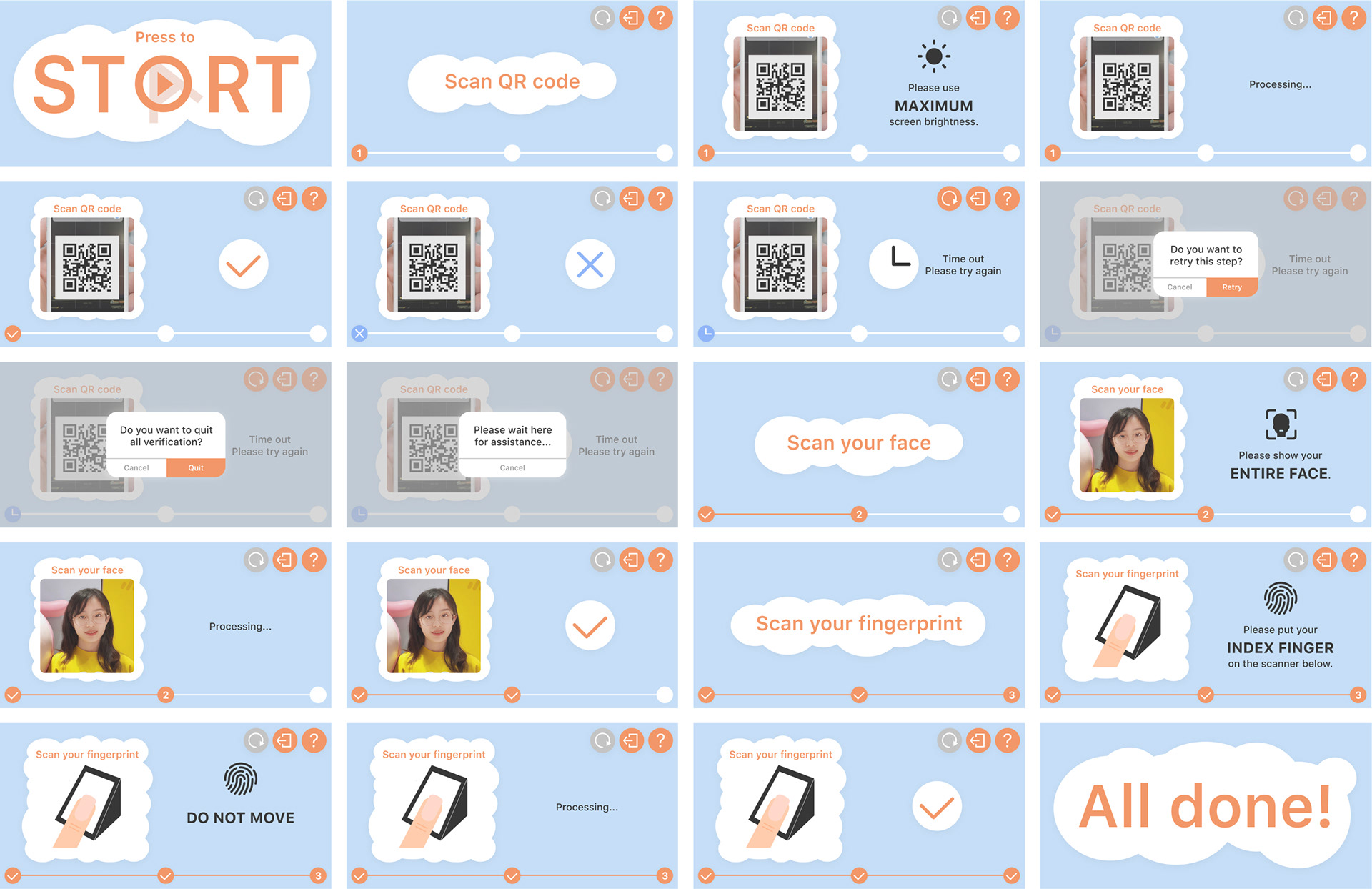
As our partner Singapore GovTech suggested, an automated ID check system would be much helpful for the security check during COVID-19, since it can decrease the interaction between passengers and staff and avoid the ID being touched by staff's gloves as well. This automated ID check system includes three steps:
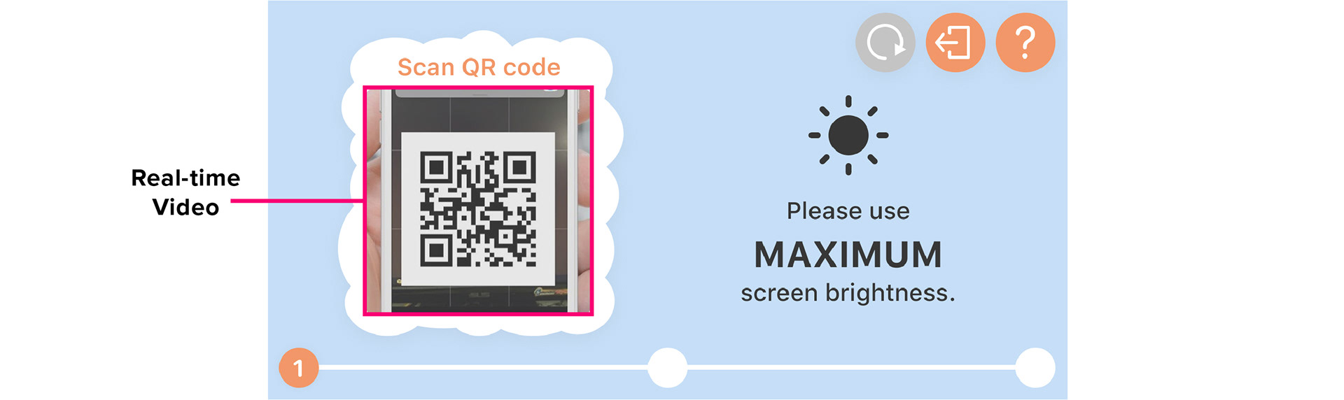
1. Scan the QR code of an ID (ID can be encoded as QR code by OpenCerts App of GovTech)
2. Facial recognition
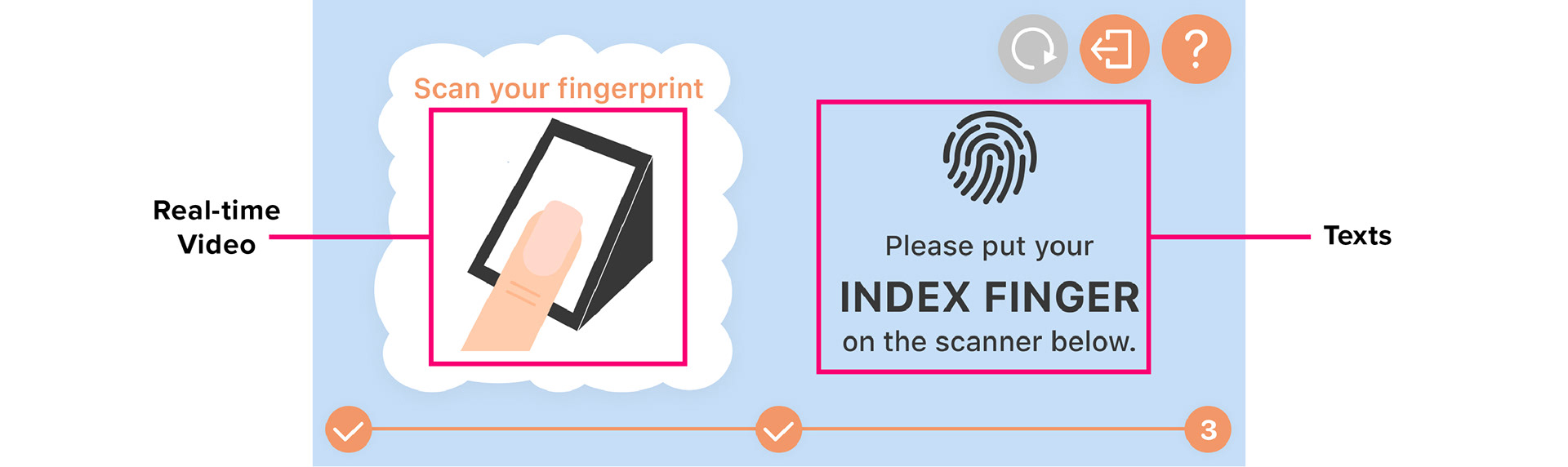
3. Fingerprint recognition
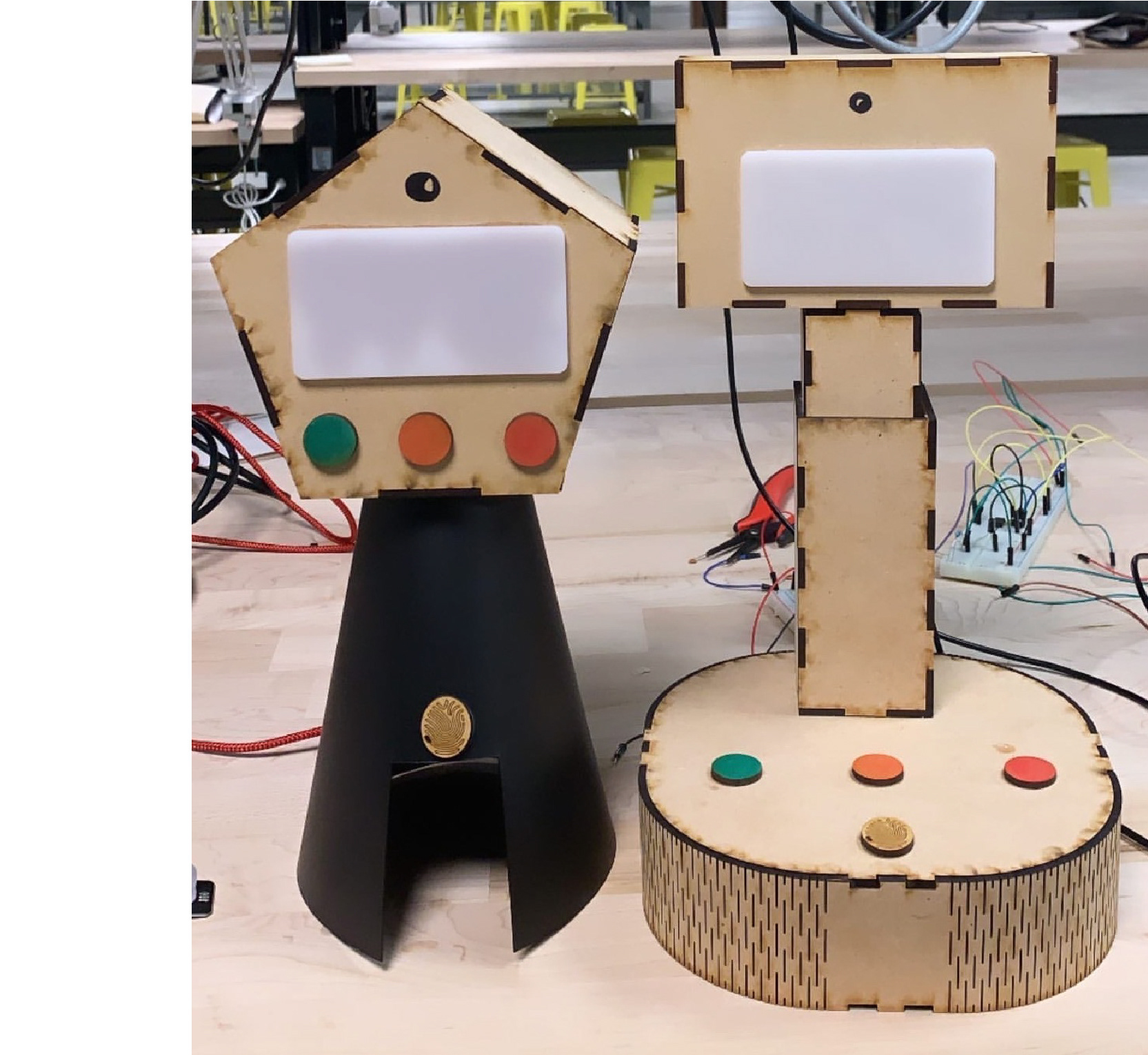
05. Low-Fidelity Prototype & Usability Test
We made two low-fidelity prototypes and recruited two participants for our usability test. The goal of this test is to find usability issues when people interact with our device.
Key Findings from Usability Test
We found that people are more comfortable with face-up buttons. Meanwhile, the screen at the top of device and the fingerprint scanner embedded in the device are also user-friendly.
06. Medium-Fidelity Prototype & Usability Test
User Flow Design
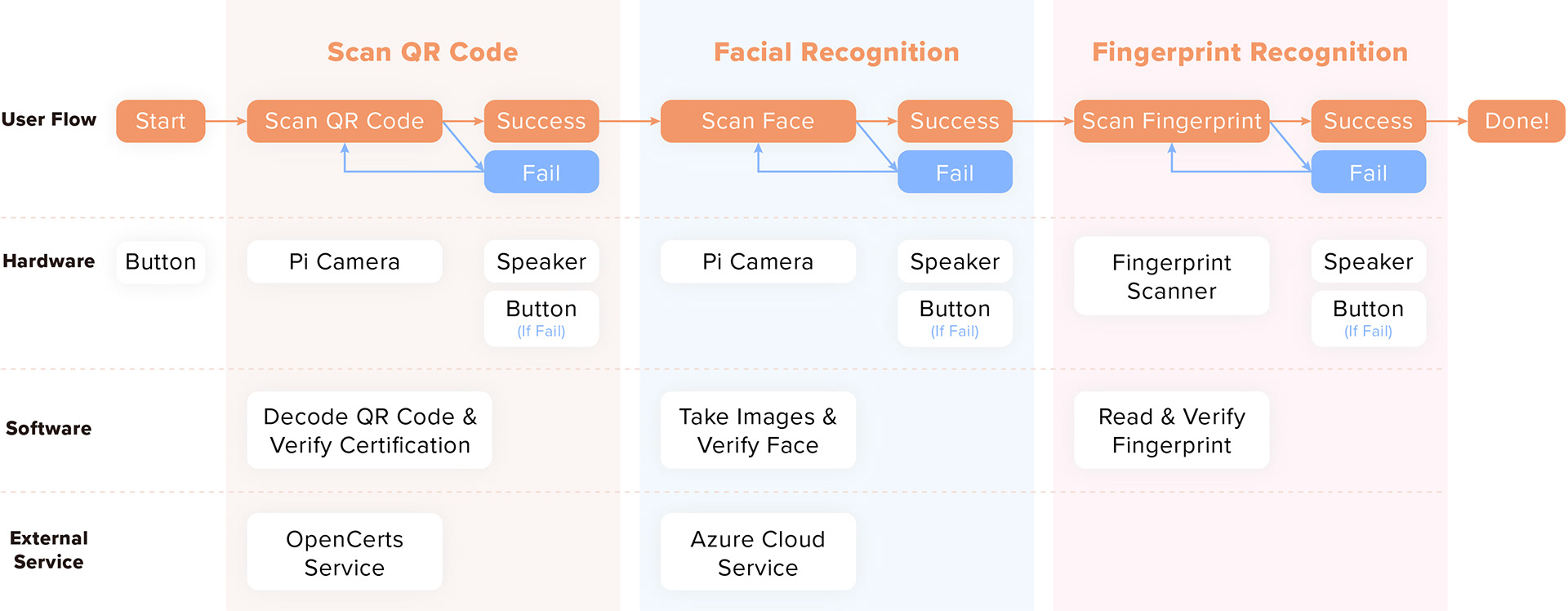
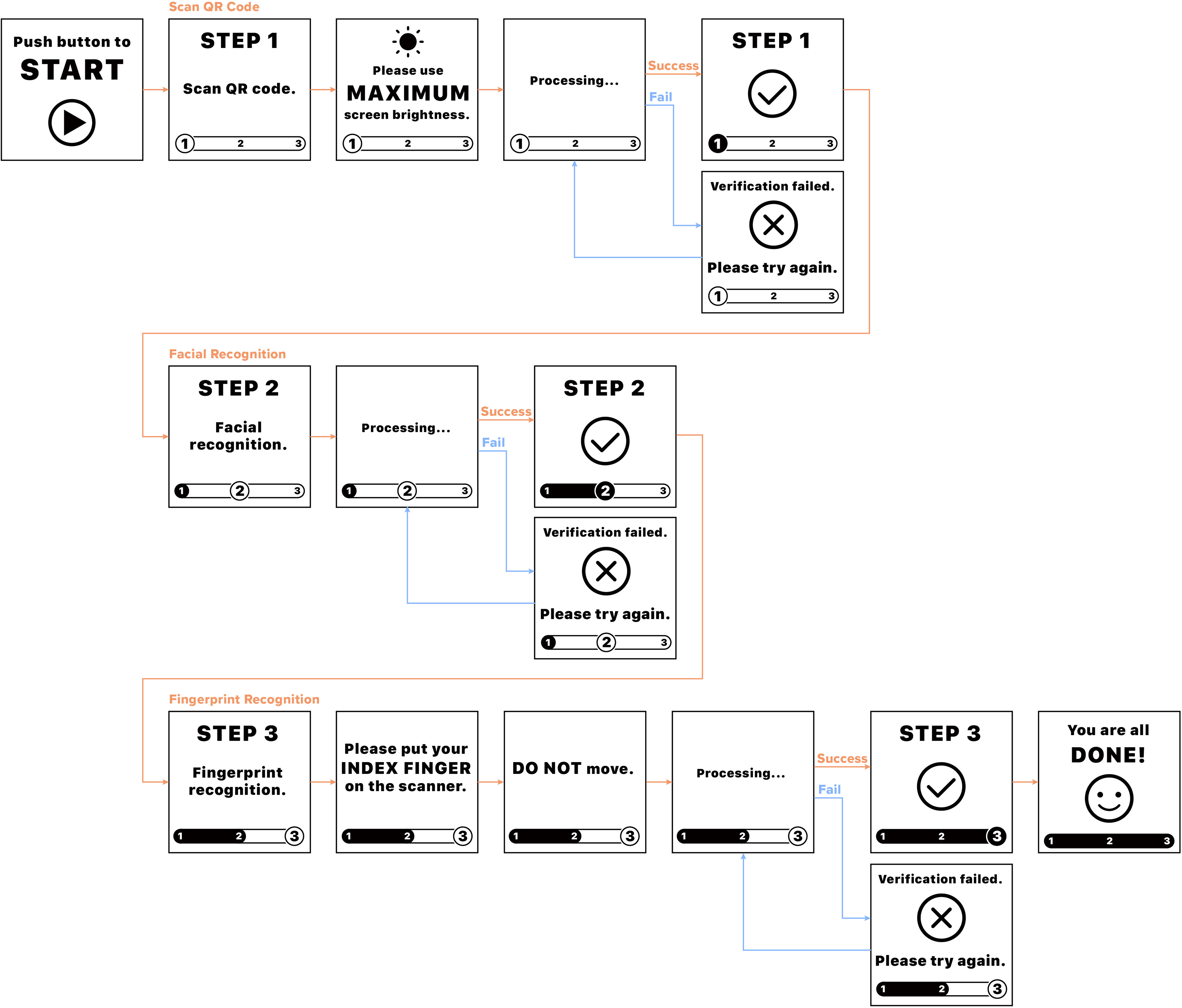
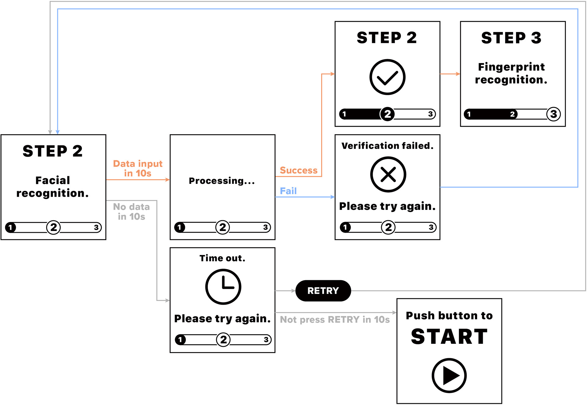
Since we used an OLED screen to show instructions to guide users step by step, the user interfaces of the screen show more details of user flow.
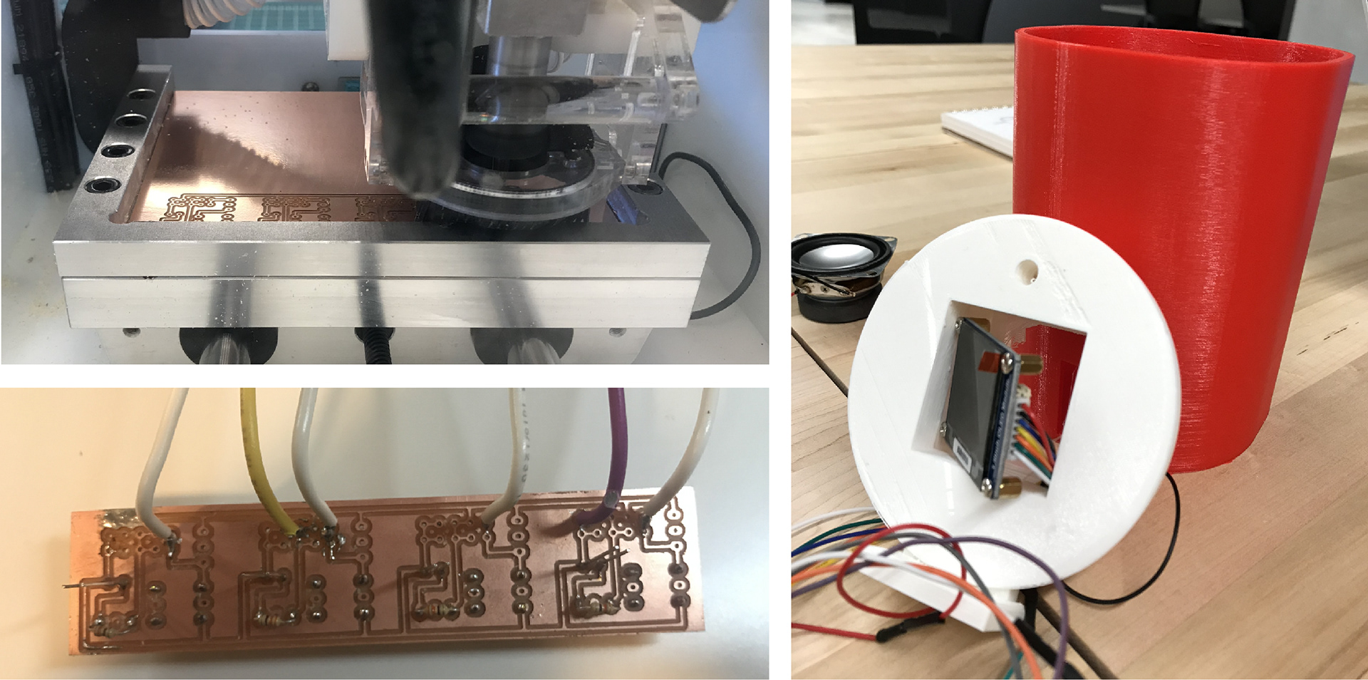
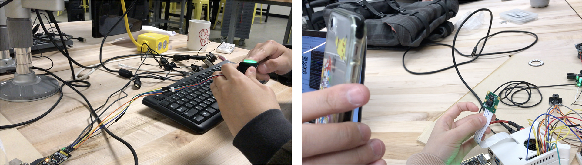
Production Process
Besides setting up hardware, I also did PCB milling to customize our own PCB board and soldered all wires on it. And this time we designed some enclosures to test the dimension of electronic components.
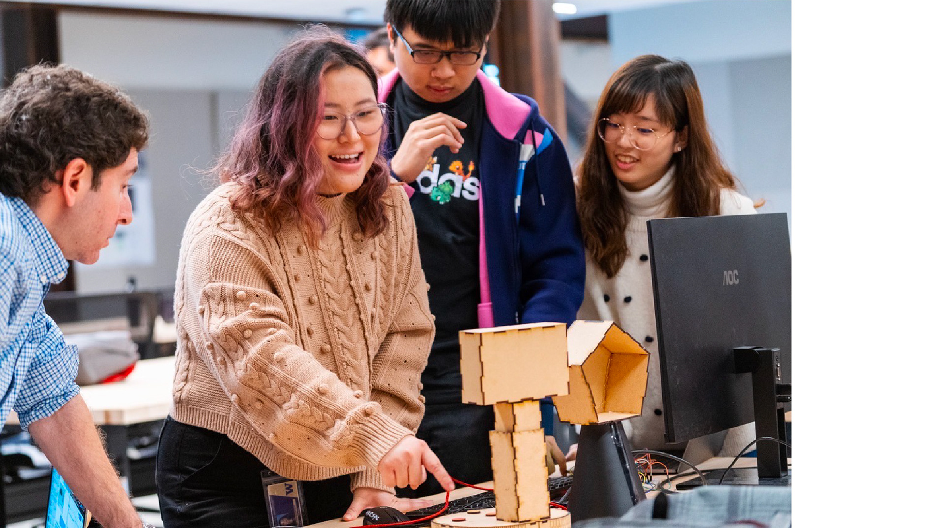
Usability Test
In this stage, we almost finished the hardware and software part, so the goal of this usability test is to test the functionality and discover some usability issues where the user experience is not so smooth. We first tested by ourselves and then recruited three participants to complete our usability test tasks.
Key Findings from Usability Test
1. There was no way to quit the program until all done. Once users started one verification step, the only choice for them was to verify successfully or fail. All participants encountered the problem of being stuck at a certain step. They repeatedly failed the certain verification, but they cannot quit the program even if they did not want to continue.
2. The program was still running after users left halfway. Once the program started, it was always under the state of pending verification. Even though the users left halfway, the program was still in that state and cannot be automatically quit.
3. The verification would be failed if there were more than one faces in the camera during face recognition. Users would fail face recognition when there were other people around.
4. The speed of processing the data was so slow that some users who failed the verification repeatedly had less patience. It cost a lot of time to take an image, transmit and process the data. Some users were stuck at a certain step and spent a great amount of time on waiting.
07. Iterations Based on Research Findings
Based on our findings from two rounds of usability tests, we optimized the user flow from UX and software aspects and redesigned the enclosure.
Finding 1 & 2: There was no way to quit the program until all done. & The program was still running after users left halfway.
→ Add QUIT and RETRY button. We redefined the functionality of buttons and decided to use four buttons in total: START, QUIT, RETRY, HELP:
1. START: Press to start using the automated ID verification system.
2. QUIT: Press anytime during the process to quit the program.
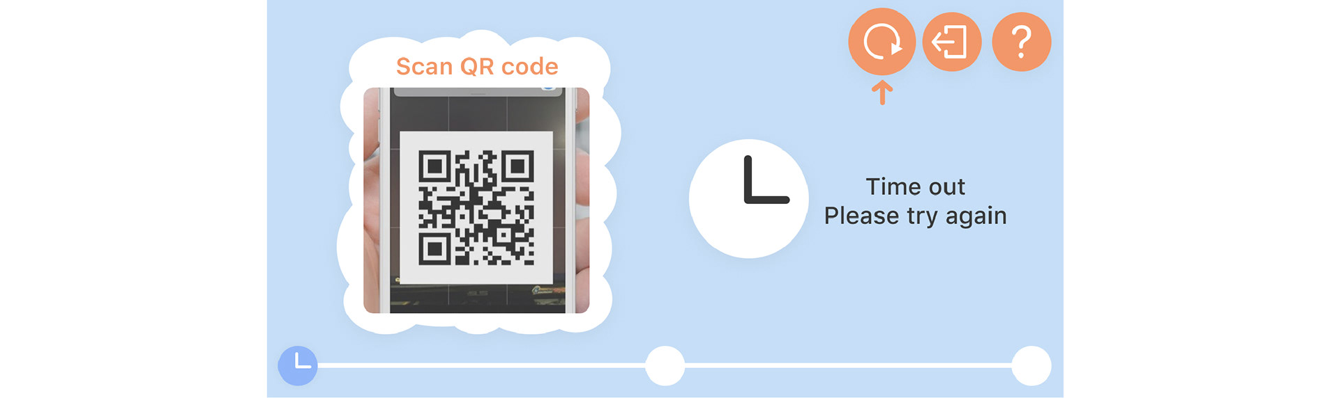
3. RETRY: Press to do the verification again if the camera or fingerprint scanner does not recognize any data for a certain period and the program is in the timeout state; otherwise, the program will be quit automatically after some time.
4. HELP: Press to call airport staff if have no idea what to do next.
Take The User Flow of Step 2 as An Example:
Finding 3 & 4 are solved by software. Our software engineer optimized the algorithm of face recognition and the way of data transmission.
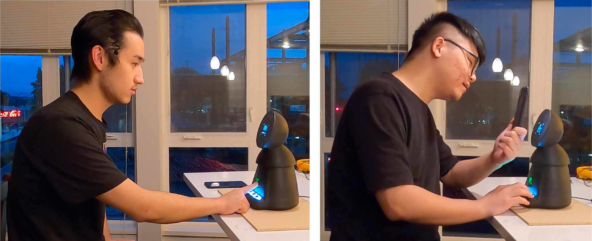
08. High-Fidelity Prototype & Usability Test
We made a lot of iterations to test the dimension of each electronic component and even tried different materials, such as ceramic. Finally, due to the unpredictable shrinkage of ceramic, we chose to use PLA (polylactic acid) filament and spray painted the exterior of the device matte black to create a more polished look.
Usability Test
We recruited two people that have flying experience to test our high-fidelity prototype. Our goal is to discover usability issues by observing their behavior during verification and recording the number of mistakes.
Key Findings from Usability Test
1. Users thought the screen could be touched. There is a large icon means start, so users thought they could touch this icon to start, ignored the text above which asks them to press the button to start.
2. Users did not know the functionality represented by the icons on the buttons. The icons on the buttons are not so obvious that users were not able to identify their corresponding functionality.
3. Users always failed the verification because they did not know how far their phones/faces should be from the Pi camera. They always moved their phones/faces back and forth to adjust the distance so that the camera can recognize them. However, it always took a long time for them to adjust, resulting in timeout.
4. When there was timeout, users had no idea what to do next. Although we designed RETRY for them, they did not know they could press a button to continue the verification. Instead, they chose to wait to see what would happen next.
5. The first time users heard the voice feedback after the verification was successful, they felt it was amazing. They said later that this voice feedback made them better understand the verification process.
09. Iterations Based on Research Findings
Based on our findings from the third round of usability test, we planned to purchase a larger touch screen. It could not only facilitate users to interact with our system, but also achieve better user experience by including more content on one screen and guiding users better.
Finding 1: Users always failed the verification because they did not know how far their phones/faces should be from the Pi camera.
→ Show the video of what the Pi camera see in real time. When users see the video in real time, they would know whether their phone/faces are too close/far from the Pi camera, and then they could adjust the distance accordingly.
Finding 2: When there was timeout, users had no idea what to do next.
→ Prioritize the RETRY button and add animations to guide users to press it. The text of timeout status says "Please try again", which indicates users should retry this step. In addition, there are animations of RETRY button, which captures users' focus and also indicates they should press this button.
Other Iterations of User Experience Aspects
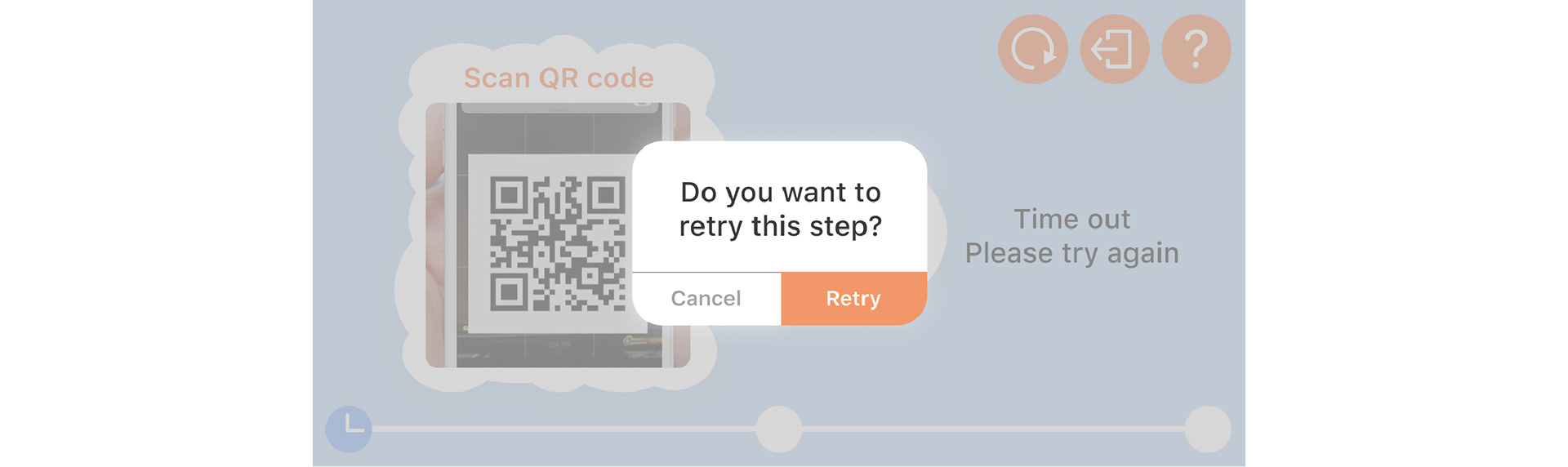
→ A pop-up window will show up to let users confirm their decision. When users press the RETRY, QUIT or HELP button, there will be a pop-up window to ask users whether they are sure to retry, quit or find some help. This gives a chance for users to abort the function before completion, preventing users from accidentally touching buttons.
→ Add instructions in each step to guide users. There are a video/graph and texts that function as instructions in each step to guide users. They tell users how far their phones/faces are, where to put their fingers and other essential instructions.
→ There is a processing page that indicates the data is being processed. After there is input of QR codes/faces/fingerprints, there will be a processing page that indicated the input data is being processed, which could effectively let users know the progress of the verification and whether their information is already scanned.
High-Fidelity Version of Screen UI & Clickable Prototype
What we could do if we had more time
Obviously, we would like to purchase a larger touch screen and incorporate it into our enclosure by changing a lot of inner structures. And then we would conduct another round of usability test with our new high-fidelity prototype, and make one more version of our prototype. In the long term, we would ask Singapore GovTech for advice and contact some manufacturers for help, in order to make a shipped version of our product.
Previous Project